Alerts
Alert messages can be used to notify the user about something special: danger, success, information or warning.
Alert Bar without close button
Alerts are available in 4 types- success alert, information alert,
warning alert, danger alert.
These Alerts can be used with
.alert-box class,
followed by one of the four contextual classes
.alert-success, .alert-warning, .alert-danger, .alert-info
.
Alert Bar with close button
These type of alert bars have a close button to close the alert
Javascript
Avatar
Avatar is an icon used to show person profile piture in profile section or navigation bars or chat screens etc. There can be both image-avatar as well as text-avatar.
Image Avatar
Avatar is available in four different sizes. To use avatar you need to use .avatar class. Then you need to add classes like .lg-avatar, .md-avatar, .sm-avatar, .xsm-avatar according to size of avatar you need.And also add .responsive-img class to img tag.


Text Avatar
Generally, starting letters of user name is used in this avatar. You need to include .avatar-text class along with the .avatar & (.lg/.md/.sm/.xsm)-avatar
Badge
Badges are used to add additional information to any content, to show counter or status (online or offline) .
Badge on Avatar
To use badge on avatar first add the avatar then add class .badge-avatar followed by class .badge-green, .badge-red, .badge-yellow, .badge-pink
Badge on Icons
You can add badges on icon as well, just include the class .badge-icon.
Text Badge
To add the badge on text, first include .text-badge class. Then to choose color and style of badges include classes like .badge-primary, .badge-secondary, .round-pill-badge .
Example of Heading with Badge New
Example of Heading with Badge New
Example of Heading with Badge New
Example of Heading with Badge New
Example of Heading with Badge New
Example of Paragraph with Badge New
Cards
We have varieties of cards.
Vertical Card + Image + Text
To use vertical cards you need to add .card-vertical class followed by .card-category, .card-description, .card-price classes inside .card-details wrapper class.


Card with Text overlay
Horizontal Card + Text + Image
Use the horizontal cards by adding the .card-horizontal class.
Sleeveless Colorblock Men Quilted Jacket . Very nice winter collection make your winter warm!!
Text Card
These are the text only cards. Add the class .text-card and inside it use .card-content, .card-action classes.
I am a very simple card I contain basic information. I am convenient because I require little markup to use effectively.
Chips component
We have contact chips for you.See how to use them.
Contact Chips
use the class .chip on the wrapper div and .img-round & .left-float on the image element.
Radheshyam
Smaira
Chip with close button
To make a closable Contact Chips add an element with an onclick event attribute
Radheshyam
×
Grid Based Layout
Use grid when you want sections in view. Check the examples below.
Grid 50:50 layout
Add .grid-50-50-layout class on the wrapper div wrapping 2 divs.

Side by side (70:30) layout
Add grid-70-30-layout class on wrapper div which is wrapping 2 divs
Side by side (70:30) layout
Add grid-30-70-layout class on wrapper div which is wrapping 2 divs
Example of product listing grid (4 columns) layout
Add grid-4-column-layout class on wrapper div
Image Slider
Sliders can be used for showing product on websites.
Add .slides-container to
the wrapper div.
Then add class .mySlides
on each slides (wrapping the img element) you want to add.


Javascript Code
Image
We have varieties of image shapes and variation like responsive image, round image ,border-around,border-round,flipped-image.
Responsive Image
Responsive images will automatically adjust to fit the size of the screen. Use the class .img-responsive Resize the browser window to see the responsive effect:

Centered Image
Use class .img-centered to centre the image

Border Around Image
To add a border around image use .img-border-around class
Border Rround Image
Make the border of image round by using .img-border-round class
Flipping Image
This is like mirror effct on image. Use .img-flipped class class on span tag containing img element.
Round Image
Make your image in round shaped by using class .img-round class
Input
Active input fields
Add .form-label class to labels and if the field is required then also add .form-label-required-field to labels. Add .form-field for input elements.
Read only/Disabled fields
Add disabled attribute to
your form element to make them disable. No need to add any extra
class.
Add readonly attribute to
your form element to make them read-only. No need to add any extra
class.
Bordered inputs
For input field having border add .field-bordered class to input element.
Focused fields
For input field having border add .field-focused class to input element.
Animated Search fields
Input field will expand to 100% width when you focused on input.
Add
.field-animated class to
input element.
Input/Form validation
Below is the input/form validation example. You will have error message and valid message on field level. For html and class, please check below html and for functionality, JavaScript code.
Javascript code
Input slider
Sliders are used to decide range for something like price in shopping websites.
Default Range slider
Custom Range slider
Add the class .range-slider to use custom slider.
Lists
List are used for listng the item either in the navigation or in the articles or somewhere else also.
List with no bulltes
To get the list without bullet add the .list-style-none class.
- list item1
- list item2
- list item3
Unordered List
Add the classes like .list-style-circle, .list-style-square to get circle and square bullet style respectively.
- list item1
- list item2
- list item3
- list item circle
- list item circle
- list item circle
- list item square
- list item square
- list item square
Ordered Lists
Add the classes like
.list-style-small-alpha, .list-style-small-roman,
.list-style-capital-alpha, .list-style-capital-roman
according to the bullet style you need.
To reverse the order of ordered list, add
reversed attribute to
ol element
- List item with numbers
- List item with numbers
- List item with numbers
- Reversed list item
- Reversed list item
- Reversed list item
- List item with alphabets
- List item with alphabets
- List item with alphabets
- List item with roman
- List item with roman
- List item with roman
- List item with alphabets
- List item with alphabets
- List item with alphabets
- List item with roman
- List item with roman
- List item with roman
Spaced List
All the above lists example was of stacked list. To get spaced list use .list-spaced class.
- list item1
- list item2
- list item3
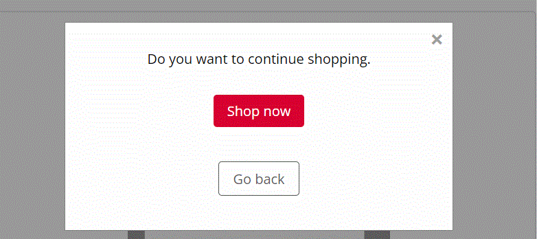
Modals
A modal is a dialog box/popup window that is displayed on top of the current page:
Javascript Code
Live Demo
Click on the button below .
Rating
Rating components are generally used to give feedback .
Read-only ratings
There are two types of read only ratings : input read-only & badge read-only.
Demo
Give your feedback
Javascript code
Toast
This component can be used for toast or snackbar component. Toast is mostly used to show feedback message. Snackbar is to used show message that need user action
Types of toast
Use the .toast class for all types of toast and then add the .toast-success, .toast-error for success toast and error toast respectively.
Live Example
Click on the button below to see the toast. Toast will disappear itself after 3 second.
Javascript
Typography
Check out below text utilities.
Heading text
Use h1, h2, h3, h4, h5, h6 for headings.
H1 heading
H2 heading
H3 heading
H4 heading
H5 heading
H6 heading
Paragraph text
For paragraph u can use p element.
And for font-styling use
.text-large, .text-medium, .text-small
classes.
This is large text.
This is medium text.
This is small text.
To align the text use .text-left, .text-right, .text-center classes.
This is text align center
This is text align left
This is text align right
Some more text styles
- To strike-through the text, add .text-strike-through class
- For bold text (font-weight:700) use .text-bold class.
- For semi-bold text (font-weight:600) use .text-semibold class.
- For regular text (font-weight:500) use .text-regular class.
- For bold text (font-weight:400) use .text-light class.
- To make text of primary and secondary color add .primary-text-color, .secondary-text-color class.
Text with strike-through.
Text with bold font-weight.
Text with semibold font-weight
Text with regular font-weight.
Text with light font-weight.
Text with primary color.
Text with secondary text color.